A new era, a new brand
05 Oct 2017
Since 1989 we have grown through four iterations. From Kevin Hardy and Associates to a partnership in Management Consortium, to HardyGroup International, to HardyGroup as we are today.
We started in a home office then moved to offices in North Sydney and next year we are on the move to the Sydney CBD. Our new office layout will reflect openness, elegant simplicity and support collaborative teamwork.
From the beginning, the business was founded and operated on a strong belief in community and the power of networks. Both have been essential to our success in Executive Search and Learning Sets. We focussed on building strong personal relationships with top talent in Health and Human Services and have built a highly professional team led superbly by our CEO, Paul Ingle.
However, the world continues to evolve and today represents a major step forward for us with a complete brand refresh, a new logo, new brand colour and a new website. Our brand is evolving just as the company is.
What’s exciting, is that this is the fusing of our strong off-line presence with the digital face and operating system that our clients deserve. As we continue to grow we remain committed to being specialists immersed in Health. Broadening our services in executive search, learning sets, leadership and organisational diagnostics whilst building a digital platform to support individuals and organisations, and, more smoothly connect talent with opportunity.
In a complex world we want to unharness complexity, keep to the KISS principle and create opportunities to network and connect people.
HardyGroup has built one of, if not the strongest network of global health leaders. We want to give this network a digital home so we can form the strongest online community in Health and Human Services, one that is free of geographical boundaries. A community that has access to the latest technology that allows for constant free flowing communication.
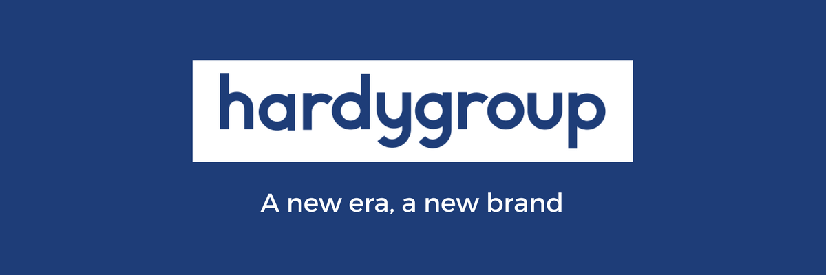
OUR LOGO
![]()
It’s lowercase, the edges are rounded and it is simple! The intention is to be welcoming, to make access simple. We want to make our welcome to you inviting and inspiring. Our logo is a representation of openness, the removal of walls. We want to be accessible, approachable and we want you, our clients, to feel connected.
OUR COLOUR
When you see our new website the first thing you will notice is that we have gone blue. There is important symbolism in the blue colour and the lower case logo. It is the colour of the ocean and the sky which in leadership is about releasing the blue ocean of talent and energy in organisations and the blue sky of innovation. It represents trust, reliability, confidence. When you see our digital face we want you to feel a sense of reliability and confidence.
We have stripped everything back and keeping it simple so users can navigate to achieve what they want to achieve in the least amount of time. The website is a strong and secure base for our digital home. The addition of on-line forms to streamline applications and an improved backend that reduces time and improves operational efficiency were imperatives for us.


I am excited about our rebrand and the symbolism of our new look. Importantly, it underpins our vision to contribute to the health and well being of society through exceptional leadership talent.